Font Scaling
October 2012As computer users, we spend a significant fraction of our lives reading text on a computer screen. As displaying text has been the primary function of computers since their invention several decades ago, one might believe that all of the issues would have been discovered and resolved by this point, or that something like a web page would at least be presented consistently across different computers. In fact, there are significant differences in how different software draws text. This is because letters are actually quite difficult to display on a computer screen.
There are a couple of reasons for letters being hard to draw that come from our drawing letters as vector graphics. By vector graphics, I mean that the shape of a character is defined by a set of closed curves that mark the boundary of the shape. We let the background color show through outside of these curves, and replace the background with the color of our text within the curves. Defining letters by mathematical curves allows us to make the text larger or smaller without regard to the resolution of the screen that the text is displayed on. This lets us reuse a single typeface for text of different point sizes both on a monitor and on printed paper.
Giving people the freedom to resize fonts is great, but freedom comes with a price. For fonts, the price is introduction of aliasing artifacts due to insufficient screen resolution. It turns out that current monitors do not have high enough pixel density to clearly display vector text. In fact, vector graphic text was originally invented for printers, which do have sufficient resolution. A typical 24 inch, 1080p computer screen has 92 dpi (dots per inch) of resolution, whereas a printer has 1200 dpi. This means that in the same area, a printer draws 170 times as many dots.
The difference in resolution is not quite as big as it sounds when you consider that pixels on a monitor can have many shades of brightness, whereas printed dots can only be off or on. However, printed text usually does not have different shades, which means that all of the extra resolution is used to improve the quality of drawn text. This means that on paper, the stem of a letter may be 15 dots wide we can easily scale text written in 11 pt Times New Roman to 12 pt while preserving the letter shapes by adding a few more dots to the width. On a computer, the stem of a letter in 11 pt font may be one pixel wide, so how do we scale that to 12 pt? Can we add an eleventh of a pixel to the stem, and what happens to the following letter that is shifted by half a pixel to the right? On computers, we have such low resolution that even fractions of pixels have a large effect on the shape of a font.
There are two ways that one can deal with this problem, where opposite solutions are used by Microsoft and Apple. The solution chosen by Microsoft, called font hinting, is to include additional information in a font description to indicate properties of a letter that should be preserved to improve legibility. For example, vertical lines in the stem of a letter are constrained to align with pixel boundaries so that lines are always an integer number of pixels wide and appear sharp. The unconstrained curves are then adjusted to connect nicely to the constrained curves. Each letter is also forced to start at a pixel boundary so that every copy of a letter is at the same offset and is drawn identically. This also saves computation by allowing the software to draw a letter once and simply copy the letter after that.
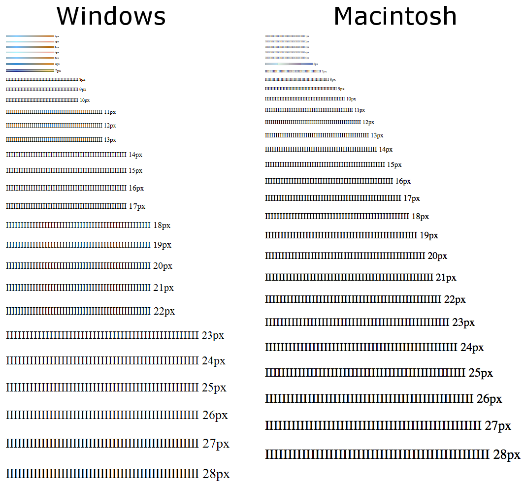
The problem with font hinting is that the shapes of letters are distorted. This means that on windows you are not looking at 11 pt Times New Roman; you are looking at something that is almost 11 pt Times New Roman. Perhaps the most important consequence of this is that the relative spacing between letters changes as you scale a font. You cannot zoom the text on a web page and expect words to stay in the same position. The space taken by text on a line may increase and a word will be pushed onto the next line, or the opposite could happen, sucking a new word into the line. This problem does not just affect the web; poor scaling pervades the entire windows interface. If you scale everything in the windowing system, text in dialogs will move and menu entries will shift slightly.
Apple's approach is simpler. They just draw the text as it is and rely on antialiasing to represent the letter as well as possible on the screen. This results in text that can appear blurry compared to the same text on windows. On windows a lower case 'L' may be drawn as a single 100% black pixel across its width, whereas in Mac OS, it is drawn as two pixels that are 90% and 30% black -- then a few words later it appears as 50% and 70% black. On the down side, lines are not as crisp and the same letter can appear different. On the plus, however, the font is given the correct weight because the 'L' in this example should be 1.2 pixels wide. In Windows, the letters were artificially thinned, possibly destroying the aesthetic of the text, and changing how the text will appear on the monitor compared to its appearance in print. I mentioned earlier that scaling of text is better, but it is hard to overstate the dramatic difference between the approaches shown in the figure below. Here is a link to the test page, where you can see how your own system scales fonts.
Which approach is better depends somewhat on the person and the context. If you need small text to be more legible or are using a low-resolution display, font hinting is your best option. Otherwise, it is better not to modify the shapes of letters. Not messing with the shapes of letters means that text scales better, implementation is simpler (font hinting is difficult to implement well), the aesthetics of fonts are preserved, printed materials look the same, and the theory is nicer.
I would also argue that the usefulness of font hinting is decreasing and will become obsolete as the quality of computer displays improves. When the standard screen size was 640 × 480, a few pixels took a large amount of screen space and we really could not afford for fonts to take more than the bare minimum number of pixels to be readable. The typical screen size is now 6.75 times bigger at 1920 × 1080 pixels on a side. The pixel density of displays will only increase with time, and a standard has already been developed for an ultra-high-definition television format that is 7680 × 4320 pixels on a side. At such high resolutions, font hinting no longer makes sense.
Assuming that font hinting is on its way out, there are two things we can do to improve the quality of text. The first is to improve the accuracy of our curve drawing algorithms. Fonts are defined as beautiful curved shapes, but our rendering algorithms cannot directly draw curves, so the curves are broken into polygonal pieces before we draw them on the screen. Somewhere in the software, there is a tunable parameter that determines how many lines are used to approximate curves. The software can either use a small number of line segments to represent curves so that text is drawn fast, or the software will use lots of segments to draw the curves accurately. Only Microsoft and Apple know the settings of their software, but it is possible to do better than any polygonal approximation by analytically rasterizing curves.
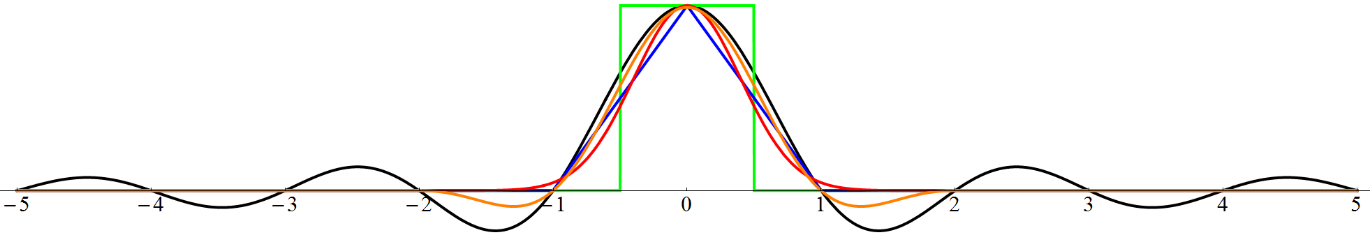
However, the biggest improvement to the display of text on a computer will be from improving the quality of text filtering. The principle behind filtering an image is that if an image contains frequencies higher than half of the resolution in your display, then those higher frequencies are impossible to show and must be filtered out. In other words, we need a low-pass filter to blur away shapes that are too small to see. Some examples of these filters are shown in the figure above. At one end of the quality spectrum is the sinc filter shown in black, and at the other is the box filter shown in green. I also show some filters of intermediate quality with tent in blue, Gaussian in red, and Lanczos 2 in orange.
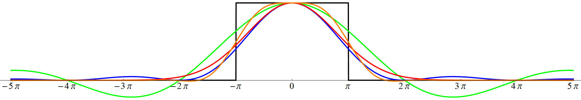
We can analyze the effect of a filter by looking at its Fourier transform. Any frequencies higher than the displayable frequency that leak through the filter will foul the image as aliasing artifacts. This is why blurred edges and lines are said to be antialiased. On the other hand, if we remove frequencies that are lower than the highest displayable frequency of the display, our image will appear blurrier than necessary. With this knowledge, we can now interpret the Fourier transforms of the filters that are shown in the figure above. The sinc filter is perfect, zeroing out all frequencies greater than the display's threshold of $\pi$ and multiplying all of the displayable frequencies by 1 so that all displayable frequencies in the image are unmodified. This is in stark contrast to the box filter, which allows lots of high frequencies to pass, alternately suppressing the frequencies too little and suppressing them too strongly. One can also see that the box filter also suppresses displayable frequencies, which causes the image to look blurry.
When most people speak of antialiasing in graphics, they are referring to the box filter. This is because a box filter is easy to calculate and is easy to visualize as the fraction of a square pixel that is covered by a shape. For many applications, using the relatively crude box filter is okay. In computer games, it is fine to blur images a little too much because a player is not going to scrutinize every detail of the image in most cases, and one image is quickly replaced by another. However, text is static and composed of very fine shapes that are at the threshold of a monitor's ability to show, and readers will intently stare at those shapes for hours at a time.
It is my sincere belief that we need to improve the quality of filters that we use to render text so that we represent the shapes of letters as accurately as possible. Reading computer text is a central part of modern life, and people form an emotional connection to the way that text is drawn. It is a shame that we do not put more effort into drawing text in a way that is both pretty and easy to read. Computer screens are unable to draw fonts as crisply and clearly as we would like, but we can draw text that appears crisper and clearer than we currently do without changing any hardware by using better algorithms.
Some additional reading about font rendering: